Recently, I overheard my husband on the phone with a health insurance sales representative talking about prescription medication insurance. The representative directed him to a particular website to request a stipend for certain medications. His next statement peaked my interest from the next room: “Are you sure this is their website? It’s so outdated…I am not sure I trust putting my information in there…”
Being the website nerd I have become, I jumped up to look at his phone to see the damage. Sure enough, the site looked something like:
- Not mobile friendly
- Not user friendly
- Outdated fonts
- Reminiscent of 1997
What was the result? He immediately disregarded that company as an option, simply because he did not trust their website. With so many options out there for any and every service or product, not wanting to deal with an outdated site is just enough annoyance to turn a customer away. Yes, it’s that petty!
So let’s take a look at what some of these glaring indicators look like and why they might be driving away potential business:
1. Your website does not fill the screen.
It’s that simple, and yes it’s the first thing I notice on desktop.
What it looks like:
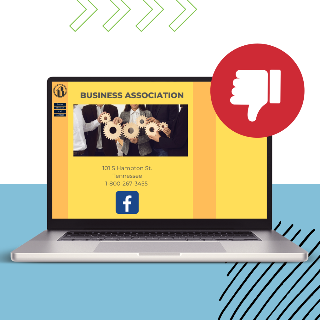
Why it’s bad: Back before massive desktop displays, fixed-width websites were the norm. But desktop computer screens are huge now. I’m typing this out on a 27″ monitor at the moment. If your site is still in boxed layout, It automatically indicates that your site is old – it just does! consider a website redesign featuring full-width content.
Websites look way better when they’re able to stretch and fill the width of the screen and appear way more modern by comparison:
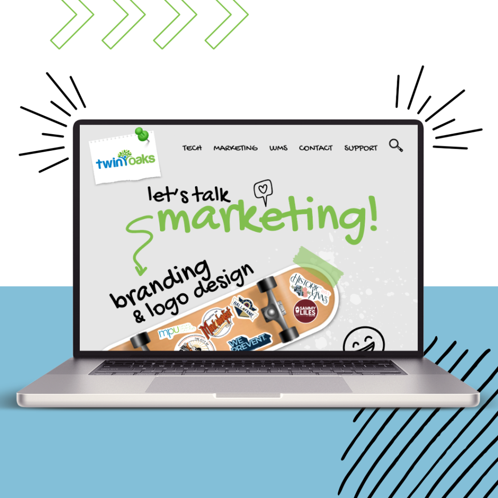
2.Your website is not mobile friendly.
Now is the time to take out your phone and look at your website.
What it looks like:
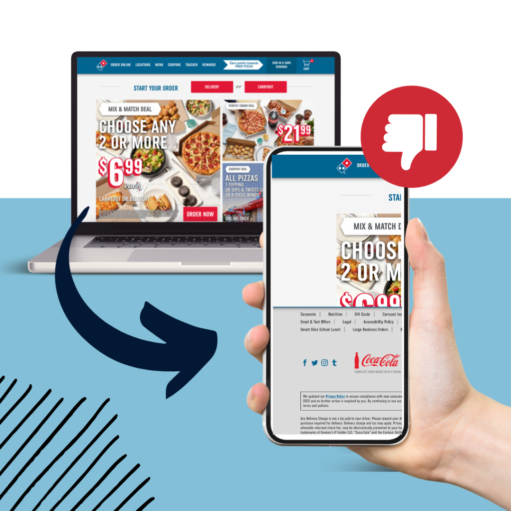
Why it’s bad: Over half of all internet users are using a mobile device to access sites and apps. If you’re curious, you could pull up your specific analytics on your own website to see exactly what % are taking a look at your site from their phone or tablet vs. a desktop. If your website is not prepared to deliver an easy user-friendly experience from a phone, you can pretty much say goodbye to that over 50% of mobile visitors.
Whether your site offers e-commerce, online bill pay, or just general information, it should have a mobile-friendly layout that’s easy to navigate. Here’s a great example:
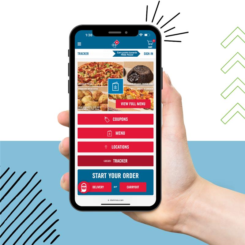
3. Ye old website fonts!
Oh man…I could write a dissertation on this.
There are too many modern options out there for you to still be rocking Times New Roman or Courier on your website. And don’t even get me started on Comic Sans! I once had my own advertising project ripped apart in front of a classroom of people in college because I used Papyrus as my header font. A graphic designer’s cardinal sin. Never again. I am surprised they let me graduate. It happens to the best of us my friends!
What it looks like:
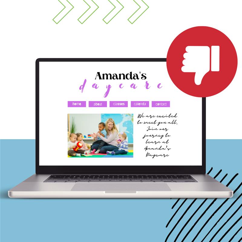
Why it’s bad: You can have the best brand spanking new website built in 2023 and a bad font will still make it look old. Fun fact: Browsers back in the day couldn’t always render fancy fonts. There was a time when web designers were limited to using a very small handful of fonts. Georgia and Arial dominated the internet as the main serif and sans-serif font selections. When web designers wanted to mix things up, they didn’t have many fonts to choose from. And so Courier and the dreaded Comic Sans became widely used. That’s why these font selections are often associated with *gasp* the early 2000’s or *double gasp* the 90’s!
Today, Google Fonts gives web designers access to a list of over 900 fonts and growing. With 19 billion downloads, it’s clear that web designers everywhere are putting these to good use!
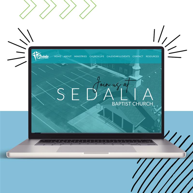
So how does your site measure up to these seemingly judgy but totally normal expectations? Hopefully pretty well! If not, rest assured that there is help available.
The Twin Oaks website team is skilled in all areas of branding, graphic design, mobile-first builds, SEO, and overall site speed and functionality. All you have to do is contact us to get started:

Written by Suzanne Harper, Twin Oaks Marketing Director

