Five best practices for a great user experience
In our line of work, we have mitigated a lot of love/hate relationships between clients and their websites. Some will hold onto a website that they’ve held near and dear for 10+ years, but it’s just not working anymore – there’s history there! Others want to make things work with a website that is super attractive but has not substance and stability. Ah…relationships – they’re complicated, right? If you are in a love/hate relationship with your website, imagine how your customers feel about navigating through the mess! We’re sharing our 5 best practices for ensuring an ALL-LOVE/no drama user experience to prevent customer breakups:
Easy navigation
If your menu items are not unorganized or sub menu pages aren’t clearly identifiable with your services, your website will be confusing to visitors. You want your potential clients to be able to find exactly what they are looking for and create a positive experience for them. Things like a service page and contact us page are crucial for clear website navigation. While about us pages are a bonus, you can always add a blurb about your business on your home page.
Mobile Friendly
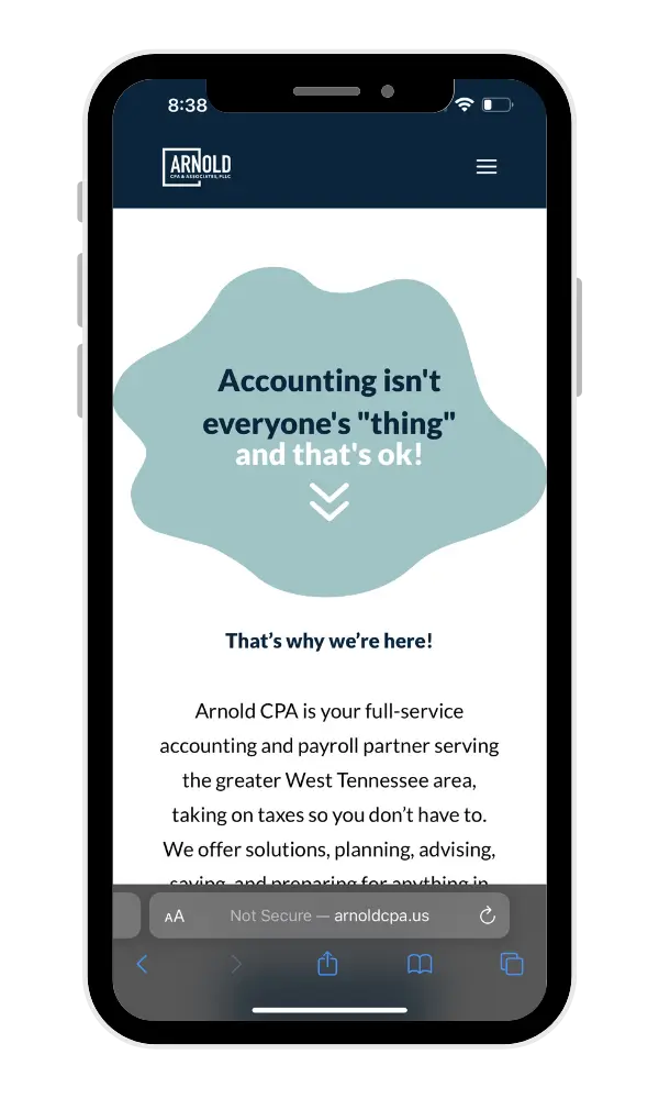
Most website browsers these days are using their iPhone or other mobile device to view your website. It is extremely important to make sure your website has excellent mobile visibility. Sometimes things look great on desktop and fall flat on mobile by being cumbersome or assets appearing off screen making buttons unclickable or words running off screen. Mobile friendly websites are a must!
Condense Content
While your website should encompass important info, pictures, CTAs, and other visual graphics that draw interest, don’t overcrowd or over complicate your pages. Keep them clean and simple. Work on keeping your value-added message or services front and center. Keep descriptions brief on main pages and use landing pages for deep descriptions for users who want to read and learn more. All graphics, pictures, and other advertising mediums should work together to enhance your message, not distract.
Check Out
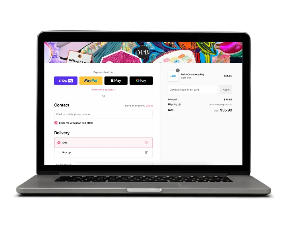
If you have an ecommerce store, make sure your check out is as quick and seamless as possible. Make sure your checkout offers easy options like Shopay or Apple pay if possible. We never encourage hidden service fees or unexpected shipping costs that will deter the shopper and cause an abandoned checkout. Yikes! Keep it quick, simple, and with as little steps as possible.
Updates
If you want your website to be loved…KEEP IT UP TO DATE. Websites need regular backend maintenance to plugins, themes, and security. These steps keep your website running smoothly and effectively. To ensure website longevity, we recommend these updates to be completed yearly at the bare minimum. Pay attention to the look of your website and make sure the colors, fonts, graphics, and photos are current and represent your brand well. Small header changes or linking your Facebook feed to your home page are excellent ways to keep your website looking current and draw interest in when a potential client lands on it.
We hope these 5 tips help both you and internet users fall in love with using your website! Remember, a good website is there to support you and your customers faithfully without drama and chaos. We’re all about some healthy relationships here!
For more tips and tricks on all things tech, follow along with the Twin Oaks Marketing crew.
Contact the Marketing Team at Twin Oaks


